My Work | More Samples | Mobile Timesheets Redesign
Mobile Timesheets Redesign
During my summer internship at ClickTime.com, I worked as a ux and ui designer on a project that aimed to create a more user and mobile friendly workflow for timesheets entry and submission. My objective was to conceptualize an updated ui and propose an ideal workflow.
Tool I Used: Paper and Pencil, Sketch
I familiarized myself with the current mobile workflow and interface and made note of current pain points and how they could be resolved. I then looked at other mobile timesheet products and compared the pros and cons of their workflows. I worked with the product manager to understand the goals and use cases of the app. With this information, I was able to conceptualize an updated look and experience.
ClickTime mobile timesheets’ primary goal is to make editing and reviewing time entries easy and accurate for employees on the go.
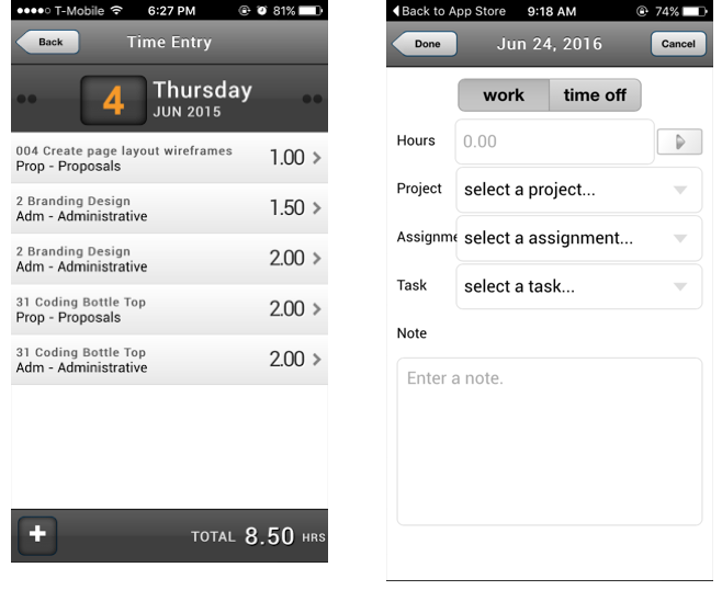
Navigation is cluttered, making it unclear where the user should complete certain tasks.
Actions, such as starting the stopwatch or navigating to different timesheets and dates, are not intuitive to the user.
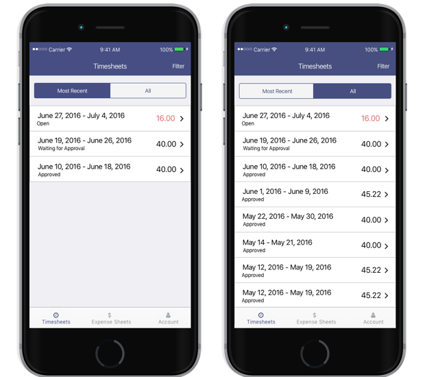
Actions for the app are grouped into sections in a simplified navigation bar. In the timesheets view, users will quickly know which timesheets are incomplete through a red color and will thus be guided to complete their time entries.
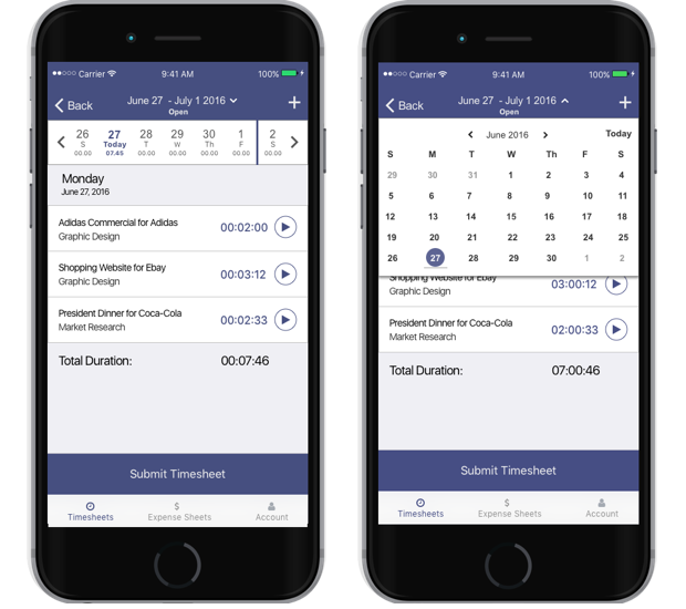
The week ribbon at the top allows for users at a quick glance to know which days they have already tracked time and which days they haven’t . They can easily navigate to a different date by clicking on the days of the week or the drop-down of the date at the top.
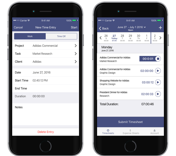
The purpose of the ClickTime mobile app is to make time tracking simple and straightforward. By having a clear focus and strong feedback on the stopwatch and time entry, users can easily time their work or edit a time entry on the go.
 Sarah Musa