My Work | More Samples | Expense Sheets Redesign
Expense Sheets Redesign
During my summer internship at ClickTime.com, I worked as a ux and ui designer on a project that looked at and expanded on the existing workflows and UI for expense sheets.
Tool I Used: Paper & Pencil, Sketch
ClickTime’s expense module allows employees within a company to add and submit expenses for reimbursement. I worked to propose an efficient and simplified workflow for the expenes module that remained consistent with ClickTime’s other features and enhanced clarity of the content.
I spoke with the sale’s team members to gage what customers frequently and commonly had issues with and assessed the core problems the current workflow presented.
I signed up for six accounts that dealt with expenses and went through their workflow of creating and submitting expenses. I highlighted parts of the workflows that were done well and parts that could be improved upon. This helped identify what ClickTime’s expenses module could adapt from other workflows and how it could potentially improves ClickTime’s own workflow.
With my research, I was able to define the components that would be pertinent for an efficient workflow and would address the current problems.
After brainstorming ideas for layout and interactions through hand-sketches, I used Sketch to quickly mock-up the screens for the new workflow. I gathered feedback on the initial mock-ups and went through iterations to ensure the decisions made were justified and ideal for the users’ workflow. I then created a linked prototype in Marvel to demonstrate interactions and a narrative for the user flow, and shared it with fellow team members.
The team at ClickTime plans to utilize the proposed workflow and incorporate it into upcoming releases.
ClickTime’s styleguide was recently established by the design team, so I ensured my design would align with ClickTime’s brand and style.
Users are also most familiar and established with the timesheet entry workflow, so I allowed for persistency to remain when proposing a new workflow for the expense module.
Keeping details about the expense sheet visible to the user during the creation of it, rather than hidden through an extra click, allows for accurate entry and minimizes errors they may make.
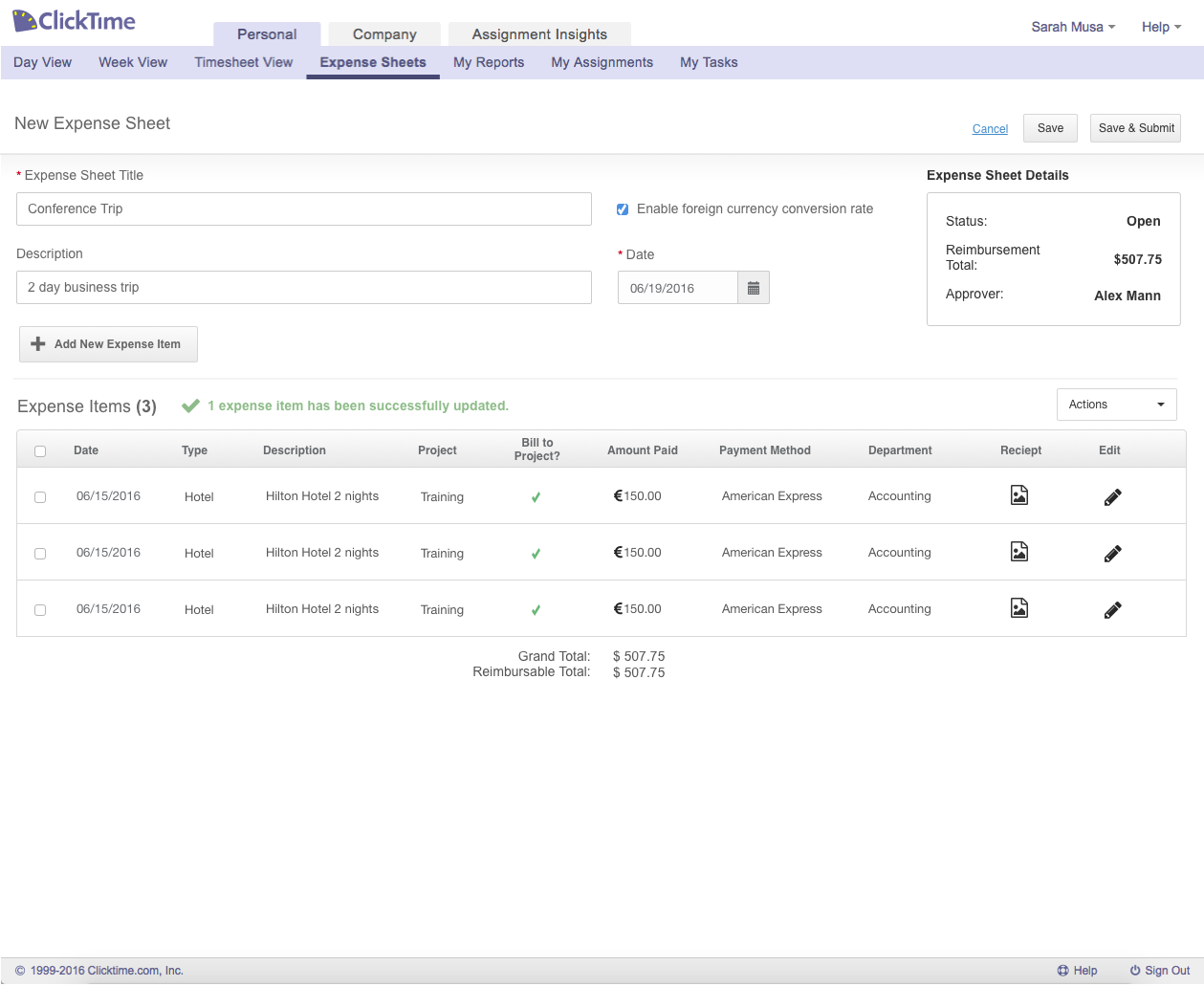
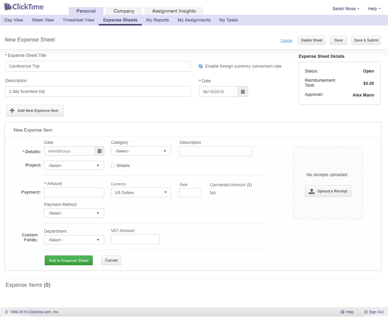
Consolidating the creation and expense entry workflow into a single page allows for a more efficient experience. This lets users remain focused and informed about details and items they have already added, and what remaining items they have to add.
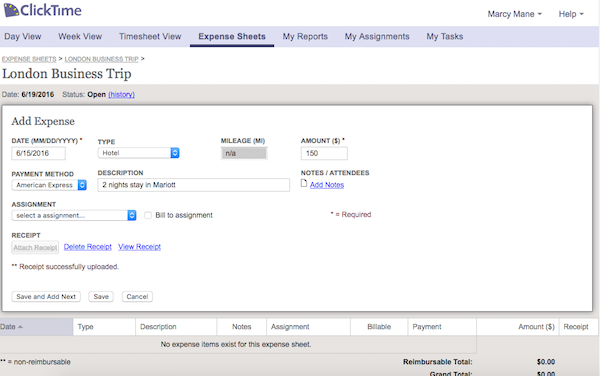
Initial mock for editing expense item:
There are three different states for an expense item: creating, editing, and viewing. In my initial concepts, I had joined these three states into one. This had resulted in certain pieces of information being hidden, which wouldn’t let the user know what information they have already added. This also did not account for a simple viewing state since users would not be able to quickly review their entire sheet without any extra clicks.
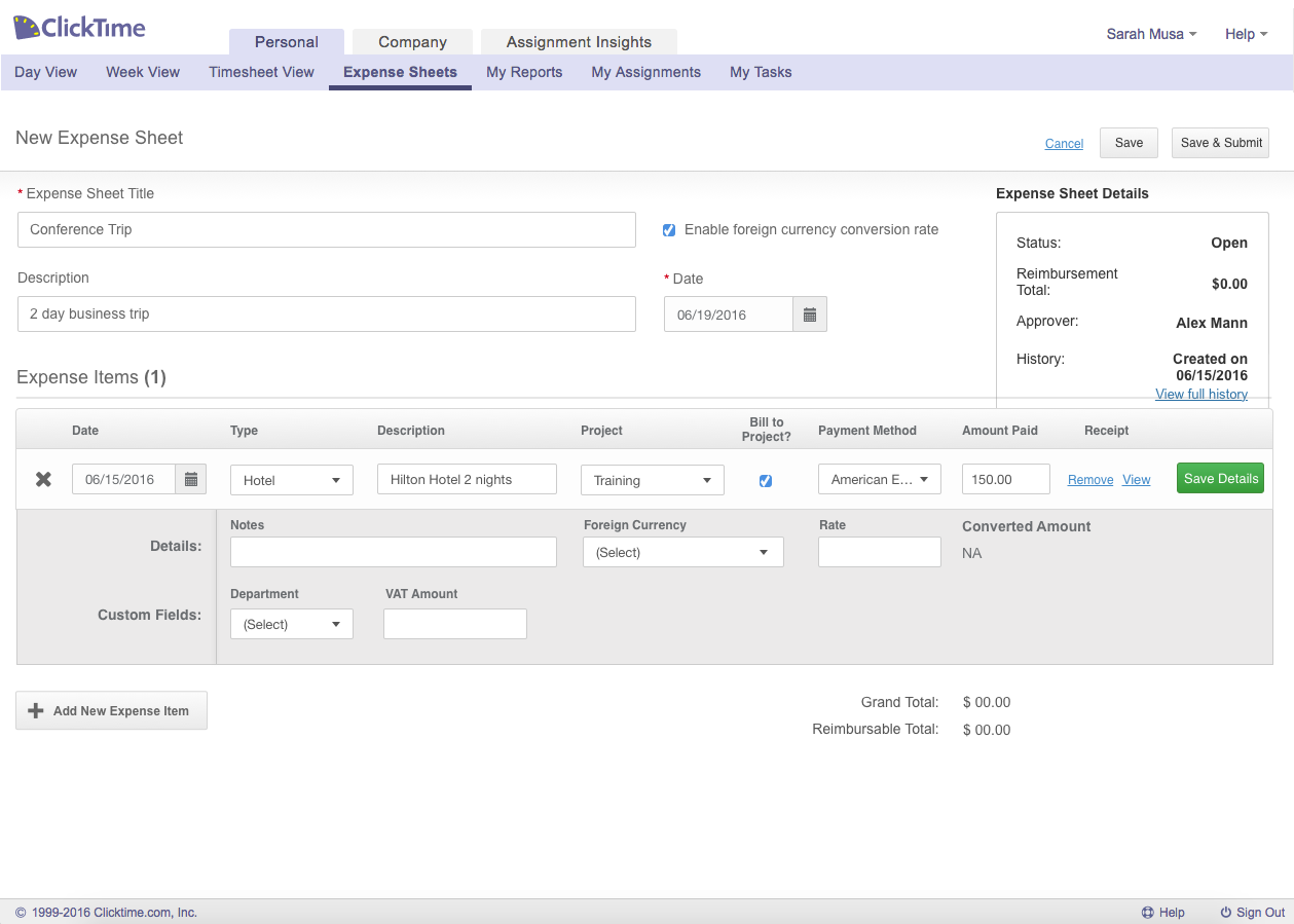
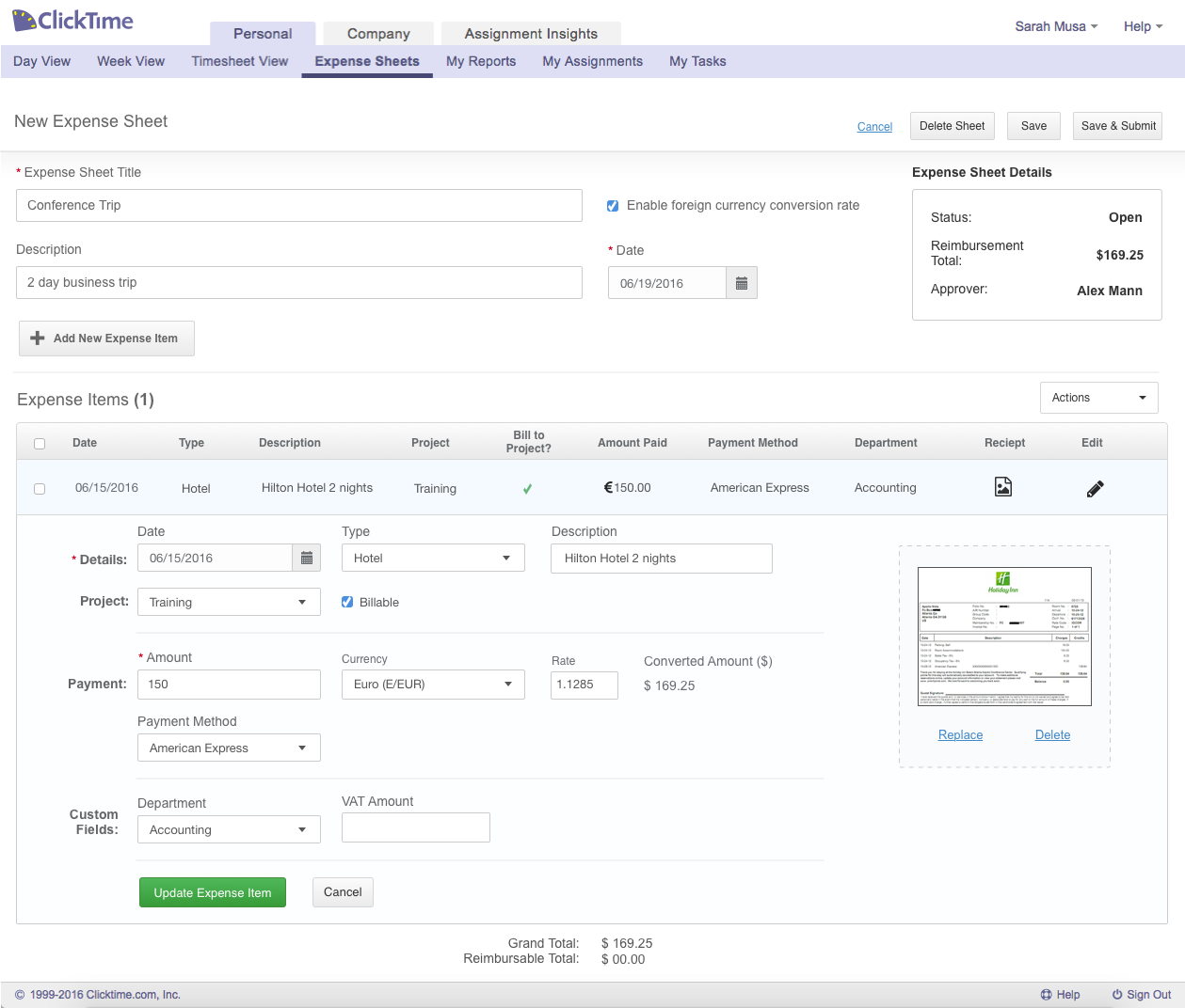
After going back to the drawing board to conceptualize additional ideas, I decided to make each state distinct to one another. Because creating an expense sheet is similar to a step-by-step form, I integrated this approach into the user interface so that the user will add, review, then edit if necessary within the sheet itself. This keeps the user focused and guided, minimizing confusion and misdirection the user might experience.
I am grateful to have gotten to work on a product used by thousands of customers already. I found it challenging to have to account for these customer’s existing workflows and took heed in drastically altering them. I also made sure that rather than fixing a direct customer’s problem with the product, I figured out why they were having this problem and addressed it with the proposed workflow. These challenges ultimately helped me learn how to deal with current users, ensure they would remain satisfied with a modified workflow and GUI, and altogether help improve their experience with ClickTime’s expense sheets.
 Sarah Musa